People who really get things done don’t really have time to cook. But they still deserve something that doesn’t feature “pop” or “pocket” in the name. Progresso wants to let busy people know that it’s just as convenient as frozen and tastes significantly better.
night out of home
A digital display that pops up when the sun goes down. We will catch people leaving the office late, or just getting out of that evening grad school class.


out of home
On busy streets and public transportation we’re looking to grab students and commuters attention.

Social
An instagram carasouel that breaks down just how much time choosing Progresso can really save you.


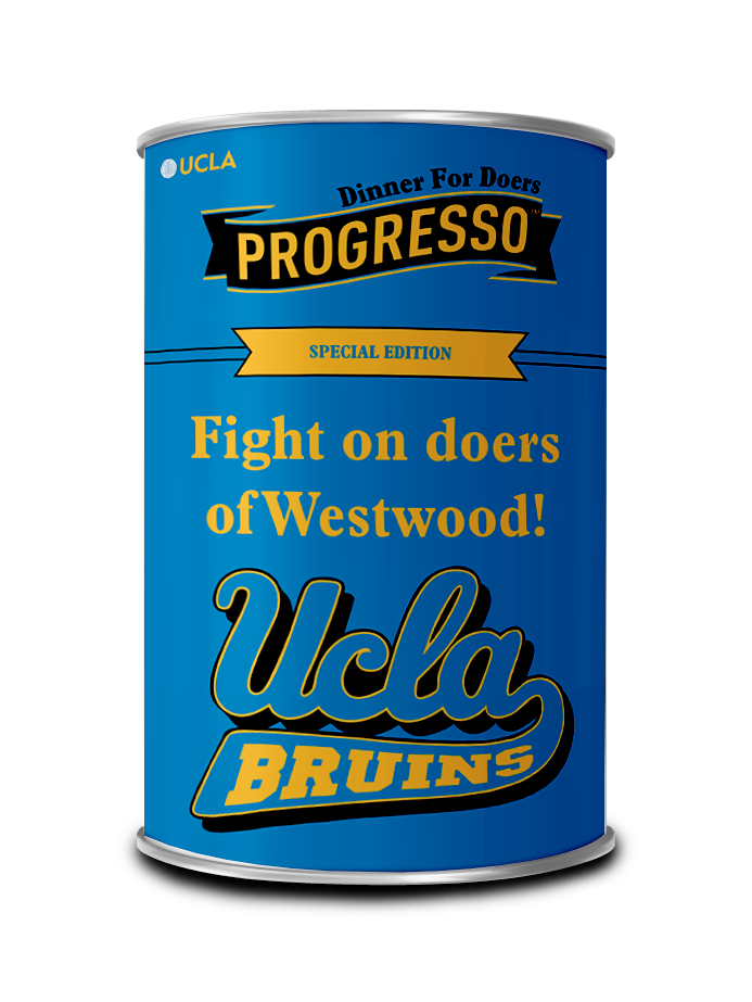
Packaging
Let's simplify things, other soup labels are noisy and littered with different combinations of colors. We’ll shift to a bright blue monochrome look with illustrations on the front that doesn’t leave consumers combing through text to find the flavor designation. With this redesign Progresso will stand out on the shelf for people with their mind on a thousand other things.

END CAPS
The soup section has way too many options. So we took the decision out of it with end caps that are impossible to miss.

Progresso will partner with the BIG 10 conference to release special edition cans. Cans will be sold in the local area of each university featuring a Progresso twist on phrases and chants unique to each school. Will it end up as decoration in a man cave or a frat house? Probably.


On campus
“Vending machines” that will sell the university edition cans of Progresso.


It only makes sense to partner with two of the biggest stars in the BIG 10. Jeremiah Smith and Juju Watkins have massive followings and represent what being a “Doer” is all about.
INfluencer NIL

COPYWRITER: DAVID ALSTON
ART DIRECTOR: KATRINA TRINH